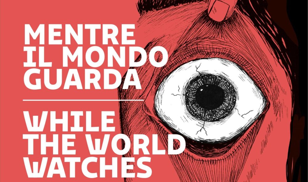
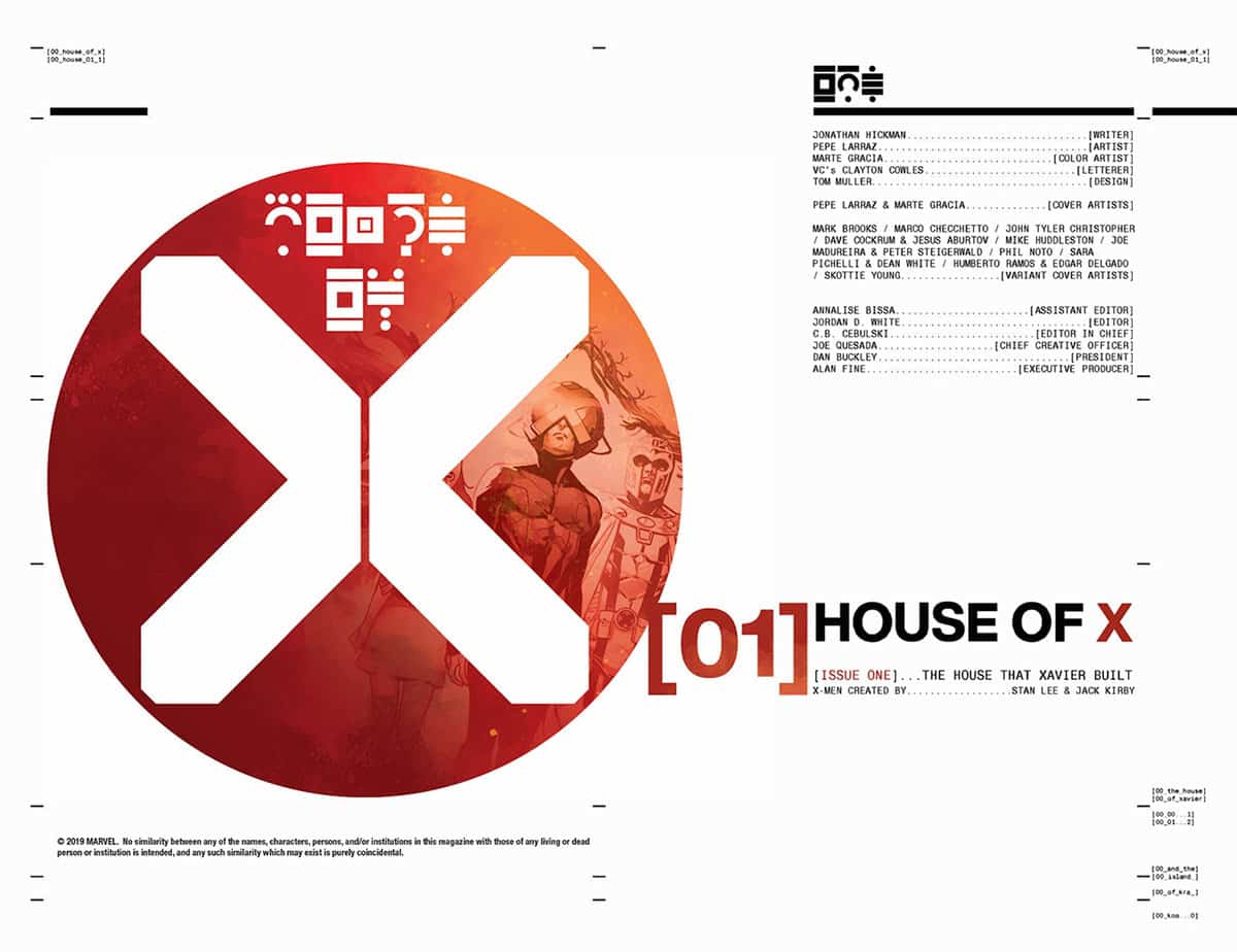
Tom Muller is a European graphic designer and he is also the one to whom Marvel Comics and Jonathan Hickman have entrusted the complete redesign of the X-Men logo and the entire editorial look of the mutant publications starting from House of X / Powers of X.
You grew up in Belgium and then moved to UK at the beginning of the 21st century. would you like to tell us about your didactic, training and professional path? How did you get into the comics world – of which you were already a reader – through your graphic design work?
I’m very lucky to come from a family of creatives and artists – both my parents were interior architects, my brother works in the 3D industry, my uncle is an architect, my grand parents were architects and painters— so I grew up living and breathing the arts and design. In Antwerp, where I was born and lived until I moved to London, I studied industrial design for a while before I switched direction — eventually graduating with a masters degree in Graphic and Advertising design from the Royal Academy for Fine Arts in Antwerp.
As a lifelong fan of US comics, and of course European comics, I always wanted to find a way to work in comics; and through design — more specifically web design — I started collaborating with artists like Ashley Wood in 2001, designing websites for him; which led to publication design work and this then led to meeting other creators and building a body of work in comics.

One of the main elements of your work on HoXPoX has been the complete redesign of the X-Men logo. Tell us about the process behind the birth of the new “X” and how you and Jonathan Hickman came to insert and use the new design logo as a narrative element within the two miniseries (for example, I think of the shape of the place where the mutant Quiet Council meets in Krakoa )?
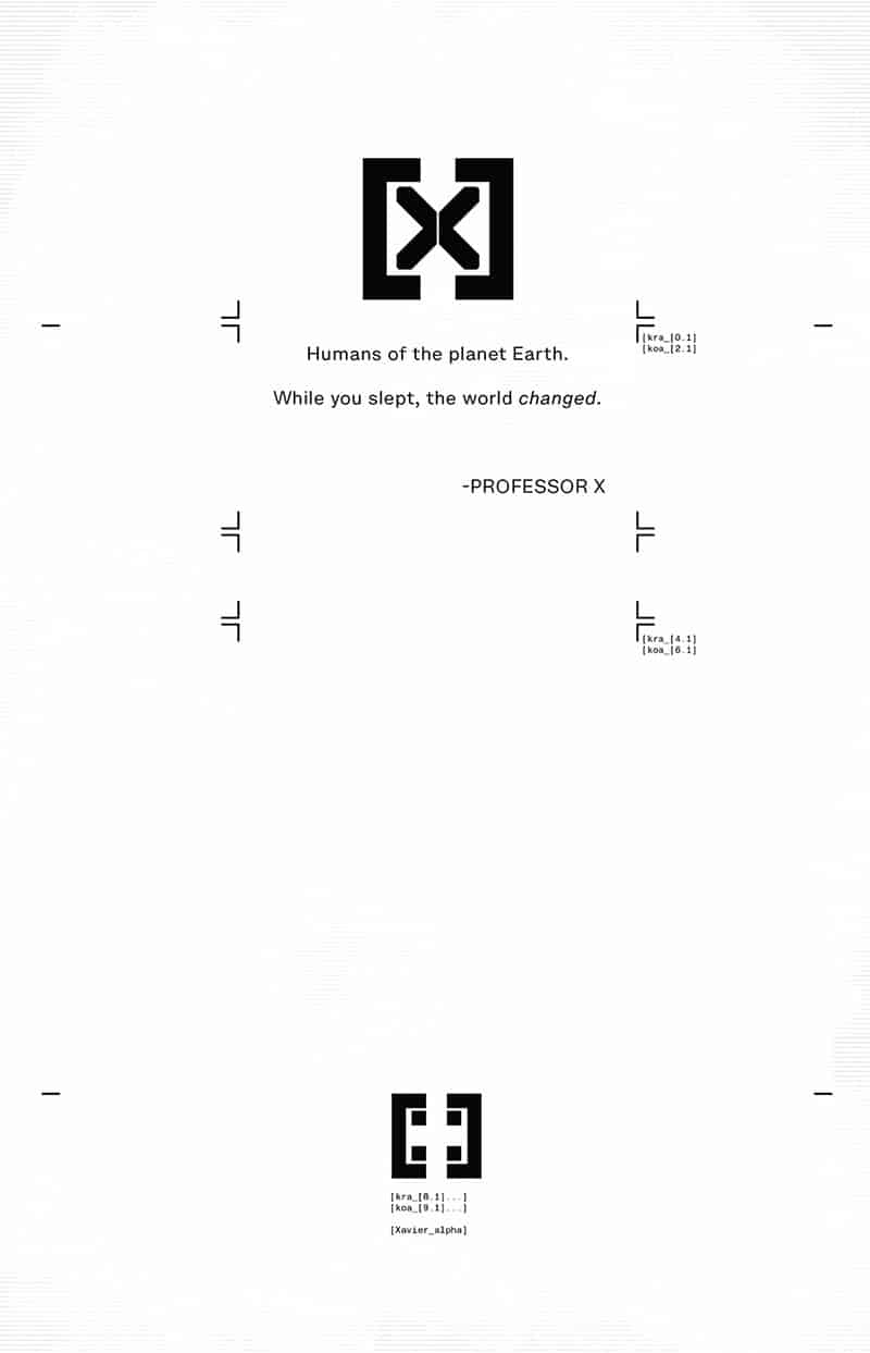
With the development of the new X mark, it was important to maintain the history of the franchise and modernise it. The X, especially the X in a circle, has been a very recognisable mark for the last few decades years in comics. The new design takes that X and modernises its design — it is still recognisable as the X-Men X; but slightly removed from that typical comic book look. Now its a modern contemporary graphic mark. That it ended up becoming an element in the actual stories is only a bonus to solidify that the new design is now part of the X-men lore.
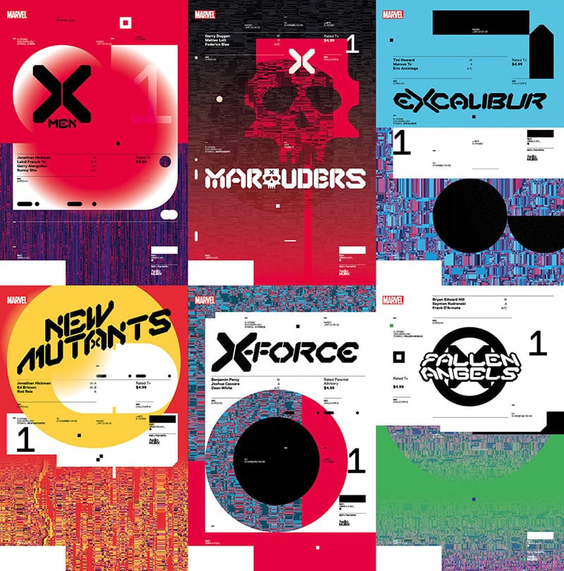
What is the approach you used for the redesign of the various logos of the new mutant titles, those already released and those announced?
The logos for the individual series were all born from the single X mark. From the X I designed a full typeface that is based on the design elements of the X mark. This typeface – created in a standard and wide setting – is then used to design all the series logos. This creates a very strong unified X brand across all the series; making them immediately recognisable. The idea is to build this new cohesive group of books where every design element is connected so readers can immediately recognise an X book.
What does it mean to work with an author like Hickman who is in turn the creator of the design of his own works? How did your collaboration unfold?
Especially at the earlier stages we worked closely together, sharing ideas and design concepts. Of course Jonathan has a plan and a direction for the stories; and with that in mind we designed a lot of assets and elements for the series. The final results are a mix of both our ideas.
 How long did the whole process that led to HoXPoX graphics last? What feedback did Marvel get as the work progressed?
I joined the project in February last year, starting with the design of the X mark, and the House of X/Powers of X logo and cover designs. One of the only points of initial feedback I received was that we needed to make sure the logo is an evolution of the classic X logo. Beyond that I’m working closely with the Marvel X-Office editorial team on the various pieces of work I’m doing for them; from logo designs and variant covers to the various book designs for all the collected editions.
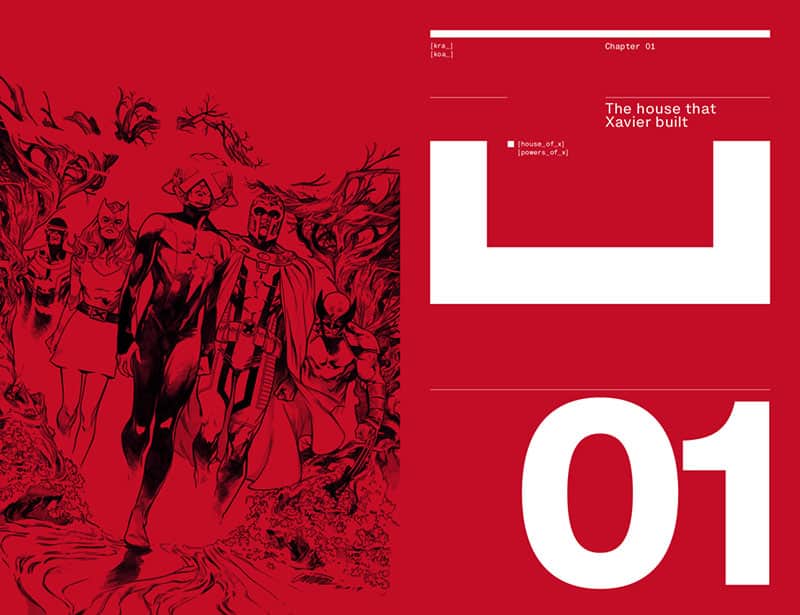
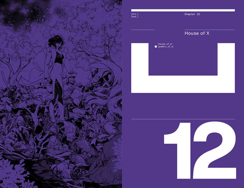
You have taken care of the entire editorial design of the HoXPoX hardcover, which in itself is a well-made object-book. How did the guidelines and the choice of colors for that work come about? And what line are you following for the design of the other library volumes that will collect the new mutant series? I was very impressed, for example, with the gray on the cover of Dawn of X vol # 1: a sidereal color, which refers to science fiction.
The only guideline for the HoXPoX hardcover collection was that we wanted to keep the round logo we used on the single issues. Beyond that there were no guidelines; so I was free to evolve the design for this collection; by using Pantone colours on the cover dustjacket; and creating new designs for the credits, chapters etc. Elements of this approach are also applied to the design of the Dawn of X collections; where the design of the credits and contents is similar to the HoXPoX Hardcover — while the overall design of this collection series is based on the shape of the X mark.


Where do you get your work from? What are your sources of inspiration outside the comics, for example in the field of architecture and design? How do they flow into your graphic design work?
A lot of my design work takes place outside of comics; as I still work in advertising and digital design — so I try to bring those sensibilities of modern and contemporary design back into comics.
Your graphic creations in the comics field for all the main US publishers (Marvel, DC, Image, Valiant) underlie your personal identity. Are there any common guidelines you always start with? For example, I know your passion for the geometric shape of many fonts, the use of pure primary colors, a closeness to a “computer” aspect of the page.
I definitely think I’ve developed a stronger personal style and approach in my work—especially in branding and publishing design. Someone once described my style as “Modernism in a sci-fi style” which I thought was very apt. I do believe in the ideas of The International Style and use that as a springboard.
The design of the text inserts present in HoXPoX, as well as the credits page refer in some respects to the graphics of vintage computer pages, now rare, but perhaps more clear and immediate for the conveyance of content. Can you tell us how they were born and why you chose those particular fonts (by the way, which font did you use)?
These pages are a mix of Jonathan Hickman and myself. I created a variety of templates and elements that Jonathan then used and customised to fit the story and the contents of the pages. The main idea was the these pages would be black and white to create a strong contrast between them and the story pages which are full colour. In terms of typefaces I chose Helvetica Now, which is a great neutral and modern font (and like Dawn of X it is a new, contemporary version of a classic design); and Helvetica Monospaced for all the data elements.

In a society where the visual impact is fundamental, which now moves on purely visual social networks such as Instagram or Tiktok, what role does the graphic care of a comic book have in attracting the public and what importance did this have in the design of the new X-Men series and your other works in general?
I think it’s all about care of design in culture as a whole. People who read comics are also on TickTock and Instagram. They play video games, consume culture and entertainment from a variety of sources. Comics should be front and centre in these visual networks as one of the purest visual mediums in entertainment. People read comics digitally as well these days, often on the same devices they use to post on Instagram. Design should always be relevant and current.
One of your most recent work, which will see the light in April 2020, is the redesign of the historic 2000AD logo for the launch of Best of 2000AD, a new magazine that will join the historic British comic weekly. I know that you have been a passionate reader of the magazine since you were a boy: what did this work mean to you and what did you want to convey with the new logo?
I actually didn’t read too much 2000AD growing up because it wasn’t always available in Belgium; but I was aware of what 2000AD means to UK and European comics culture; so it was great to be asked to help them launch their first new title in 30 years. 2000AD has always looked towards the future; so I when I designed the new Best of 2000AD logo, and publication design I wanted to take all the best elements of the magazine’s history and update it to something that looks forward.

Thank you so much for your availability and your answers, Tom.
Interview conducted via email in February 2020
Tom Muller
 Tom Muller is the founder and creative director of helloMuller, an award-winning independent design studio. His work moves through the fields of graphic, digital design, the study of brands and products in the languages of comics, cinema, advertising and gaming, starting from modernist principles revisited in a contemporary key.